
A Clearer, Lighter Platform And Guides Experience
When you're deep in event prep, the last thing you need is to squint at a confusing label or fight with a pop-up.
So we've given Platform and Guides a refresh: a new light theme, clearer wording and pop-ups that behave themselves. Here's what's changed.
A Lighter Look, With More Choice
Platform and Guides now offer a refreshed light theme. It's part of our new design language, built to give people with visual impairments more choice in how they view and work in the platform. Everything is still in the same place, with a cleaner, more consistent look across both apps.
How to switch it on: Accessibility > Light Theme
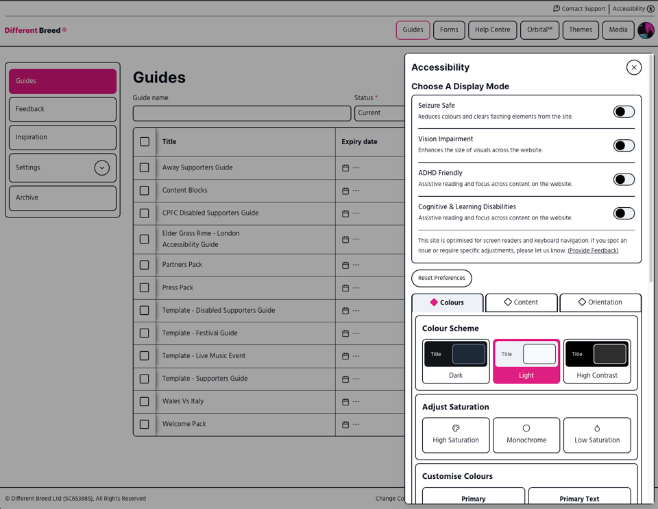
Guides has had the same treatment, so moving between the two apps feels like one connected experience.
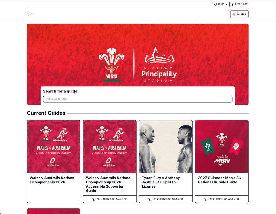
What about the fans? They get the option too. Enabling you to cater to a wider audience without the need for the fan to have their own workaround.
Clearer Wording And Better-Behaved Pop-Ups
We've rewritten the labels, messages and help text across Platform so they say what they mean in plain English. That means less guessing when you're setting things up, and fewer moments of "what does this button actually do?".
- Clearer Labels: Buttons, fields and menu items use simpler, more direct wording.
- Easier Messages: Confirmations and error messages are quicker to read and act on.
- Help Text Where You Need It: Guidance sits where you need it, in language that gets to the point.
- Pop-Ups That Behave: Pop-ups display properly and get out of your way when you're done.
Both apps also have general visual and usability improvements, so everyday tasks should feel a little smoother. New colleagues and seasonal staff should find it easier to get up to speed, too.
Which Label Still Confuses You?
We've tidied a lot, but you use these tools every day. If a label, message or pop-up still makes you stop and think, hit reply or email us at help@differentbreed.events.
